In a marketing piece as small as business cards, the choice of font can make or break the design, so your own palette of free fonts makes the task easier. Since the purpose of business cards is to convey contact information, a font is made even more important for such a weighty document.Make sure that your business card printing is a success by using a font that will both look professional and remain readable at such a small size.
Take a look at the following free fonts– maybe you’ll find the right one for your business cards!
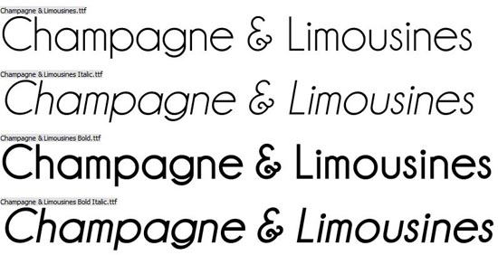
Champagne and Limousines (download)


Tips for choosing fonts
- Using a combination of fonts is a great way to make a design “pop”, but only if you know exactly what you’re doing. The weights, types, and “moods” of each font have to be taken into account before pushing through with a final design.
- Each font has its own feel. A font like Papyrus or Comic Sans for example, may not be appropriate in corporate copy. Neither Helvetica nor Futura would be the best font choice for a children’s party. It’s really a matter of using fonts appropriate for the audience and context.
- As a rule of thumb, serif fonts (fonts with small strokes attached to the top or bottom of typefaces such as Times New Roman, Georgia, Bodoni and Rockwell ) evoke a more traditional classic style that lends well for smaller print and larger bodies of text. Sans serif fonts (fonts lacking the mentioned strokes such as Helvetica, Futura, Avenir) are good for suggesting a modern style and are well-suited for online text and headers. Exceptions abound, of course.
- Script fonts such as the free fonts in this roundup are best used sparingly. They look “off” if used in an large body of text and are best suited to headers and other similar applications.
The post 20 Free Fonts for Fabulous Business Cards appeared first on PrintPlace.com Blog.